OUTSET ISLAND
I had the idea to create a more complex scene, with multiple objects and on a larger scale. Considering my skills at the time, and what I knew how to do, I knew that it still had to have a low-poly aesthetic with simple lighting, so I started looking back at Gamecube era games, and I remembered Legend of Zelda: The Wind Waker.
It checked all the boxes.
My initial plan was to try and get as close to a One-to-One recreation as I could, with animations of Link and the various NPCs on the island running from house to house, and a boat circling the island with cartoon smoke stacks wafting up. By the time I got to the stage of actually adding those things, I was so burnt out and frustrated by modeling and organizing everything that I never wanted to look at this island again.
But there were some valuable lessons I picked up on the way that will make the next project go that much smoother.
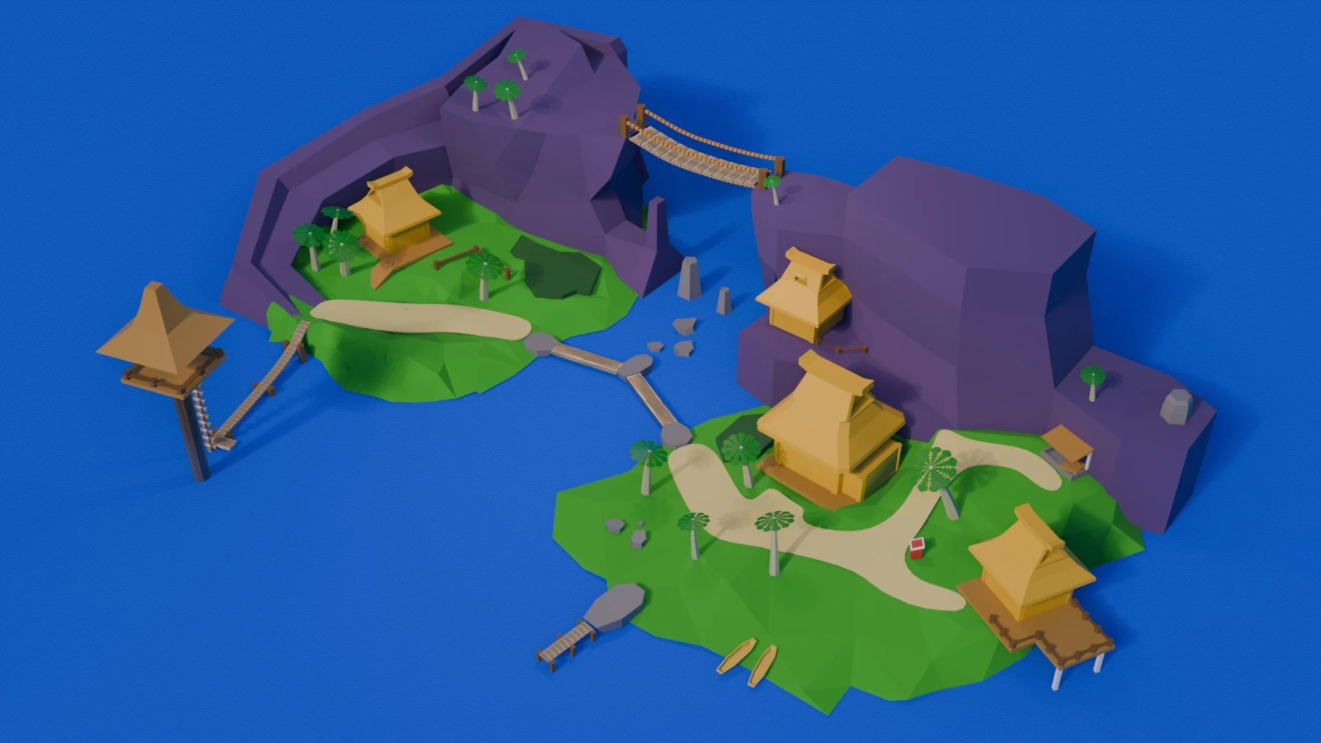
The Final Render
Pre-planning
ESTABLISHING SHOT - Keep Camera at distance
ORBIT PAN - Rotate camera around a fixed point
LOW L.O.D. (Level of Detail) - Reduces poly count, allows quick edits, better matches Gamecube-style
SIMPLE LIGHTING - Soft Shadows, Single Directional Light, few Area Lights
SIMPLE TEXTURES - Maintain low poly Gamecube style
Creating The Island Base
I created the island base by starting with a single plane. I sculpted the rough shape of the island using Blender’s sculpting tools. From there I used the Remesh modifier to trim away the excess area from the plane that I did not use. The plan was to use another plane to represent the ocean and did not want them overlapping. Now, the poly count for this sculpt was around 10k polygons. I then used the Decimate modifier to reduce it down to about 150, which gave me a nice blocky shape that will fit the low-poly aesthetic.
Doing the islands this way left a lot of overlapping faces and vertices along the bottom of the mesh. It took me about an hour to carefully carve away the remaining overlapping geometry.
Adding The Cliffs
To create the cliffs on the back of the island, I simply started with a subdivided cube and scaled and extruded the faces to get the desired shape. I knew that I wanted the path to the the upper house to blend with the island sculpt, so I left myself plenty of room to shape it to. None of these cliffs were going to deform as part of any animations, so triangles and N-gons were a non issue.
Liking the results, I repeated the process for the second island. It came out slightly higher in detail than the first, but not distractingly so so I left it. I eyeballed the relative placement of the two islands to each other and left space for plenty of “ocean” between them, which ended up as another plane that I textured blue. This was roughly the end of my first day on this project.

Sculpt

Remesh

Decimate


Adding Basic Props
With the basic island layouts created, now came the fun part; set dressing. Starting with Link’s house, I would be able to reuse and modify the geometry for the platform, house, and railings throughout the island. There was nothing particularly difficult about any one prop, but this is the most objects I’ve included in one project file, so keeping things organized as I went was incredibly important.


The Bridge and Watchtower
The bridge and watchtower areas were probably the most fun parts to work on, if for no other reason than getting to experiment with arrays and placing them along curves.
Using the Array modifier, I was able to generate all the wood planks of these pieces along a Bezier Curve instead of copying and rotating them to match the rotation. Doing it that way, I’d almost certainly have a crooked dock at the end of everything. Adding a small offset factor creates the gaps that you’d see. The most annoying thing though, that I spent hours beating my head against, was figuring out where the origin/pivot point was and how it interacted with the Bezier curve’s. When things didn’t align correctly, the planks would move in weird extreme ways relative to the orientation of the curve.


The Paths
So the paths between the houses was originally supposed to be a texture material (more on that in a bit), but we ended up making them physical objects and experimenting with more modifiers.
The paths were created with planes projected above the ground and extruded in a rough approximation of the final layout. From there I worked with the Shrinkwrap modifier so that the plane stays snug to the ground. Shrinkwrap works by overlaying the geometry of one object on to another and lining them up around the vertices. Going for a low poly style worked against me in this case. Fewer vertices means fewer points to connect to which means getting a close wrap becomes a pain in the neck. Whatever, we’re committed now.
The Subdivide modifier added extra geometry for more control and better feel, while the Solidify modifier added some depth to the otherwise 2D plane. While there are clear gaps between the path and island geometry, it doesn’t show in the final render.


Texturing
Texturing is the wall preventing me from the next jump in render quality.
So, obviously the majority of the scene are only colored in with very flat, simple textures. The only thing with a proper image texture are the various wood planks in the bridge and dock pieces. I had some success projection mapping an image of the island from the game on to my own (it lined up really well, so I was extra proud of my sculpting). However, because projections only work from very specific angles, the illusion disappears as soon as the camera moves. Therefore, that route was a no go. My thought process at this moment was, “since the camera is gonna be so far out, and we’re basing this off of a cartoon Gamecube game anyway, we can get away with just basic colors.” But I still wanted to try some real UV mapping.
I unwrapped the simple cube used to form the wood planks. I found a screenshot of Toon Link crossing the bridge with a nice close-up of the original plank textures. But there was a problem; the shadow. I brought the game screenshot into Photoshop and smeared and painted over the stripe of shadow with woody coloring. Voila, no more shadow. I was super happy with the results and stuck that wood texture on all the planks. While it is a much more detailed texture than the others, it’s also subtle enough that it’s not glaring in the final video.


The Camera
Finally, we come to the shot composition and final animations.
So how do you do a clean orbit of a pair of islands with a key framed camera animation? Well I can tell you for sure that “eyeballing it” does not work. Once I placed my camera in a spot that would give me good coverage, I turned on every composition guide that Blender’s default camera rig had to offer, centered my frame on the middle rock, and got to work key framing the position and rotations.
It. Did. NOT. Work.
The animation was too wobbly. Every single small bump or elevation change. Trying to move in a circle with no reference point. Everything moved wrong. No joke, I got seasick watching it back.
I did some digging online on how other people did a similar shot and landed on using an “empty” object. An empty has no mass, casts no shadows, and does not appear in renders. A.K.A, a perfect anchor for the camera. I parented the camera to the empty so that it was near the center of the shot. Now anytime the empty moved or rotates, the camera moves with it. Boom. I keyframed the empty to spin about 270 degrees over four seconds, speed up for last of the rotation, and follow through for a perfect loop. The project was finished.


